The Peacock School of Highland Dance
Logo Ideation
The client approached me with so much optimism for the future of his dance studio. He needed just needed some help to create a brand identity that would allow him to project the professional standards he had earned from Scotland.
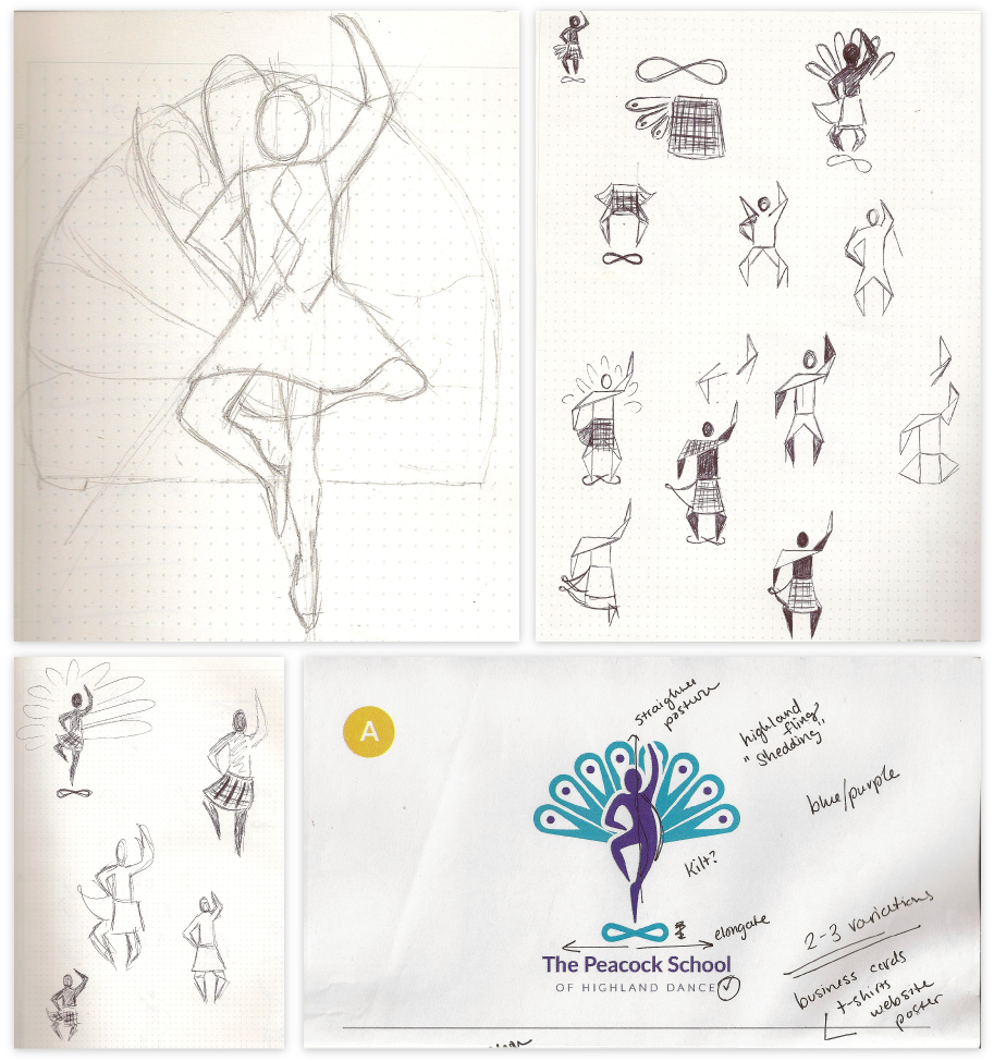
He'd worked a little with another designer who'd gotten busy and they landed on the idea of using a dancer and peacock feathers. Francis Peacock was a famed instructor from Aberdeen, Scotland the founder wanted to commemorate. A dancer because the school is inherently to teach young and old how to dance in the traditional Highland style.
From this idea I began sketching different logo shapes. We added the infinity symbol to represent a common Highland dance step. We tested both organic shapes to be in keeping with the fluidity of dance, but also geometric shapes to represent the strength and precise quality of the movements.
Iteration
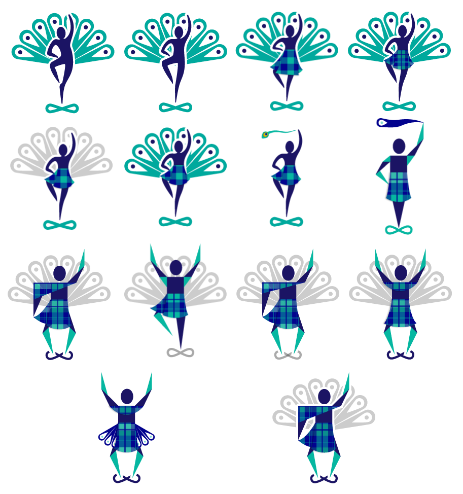
I created vector images to test out the sketched ideas, and began working with how to incorporate the tartan kilt, the peacock feathers, the infinity symbol, and color in a way that was professional and approachable.
It was a challenge with so many elements to incorporate. Ideating in vector form really pulled out the limitations that including that many elements posed. Geometric poses created too much noise when paired with tartan. Tartan needed to be simple to have impact without being overwhelming. Peacock feathers had dramatic visual weight regardless of color and size.
We ended up deciding that simple tartan, and a organic dancer were the best moves forward. Including peacock feathers in their logical placement and color seemed to be the right choice as well. I figured out a clever way to include the infinity symbol in the word mark to reduce the complexity of the logo.
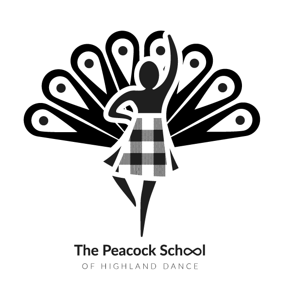
Logo
The final logo incorporated all the ideas that the client hoped to have. They were woven together in a way that seemed logical and not overwhelming, and could work at both a large and small size. I even translated it into black and white to save on printing costs.
I used the double o's in the word school to create the infinity symbol of such a primary dance step, much to the client's joy.

Assets
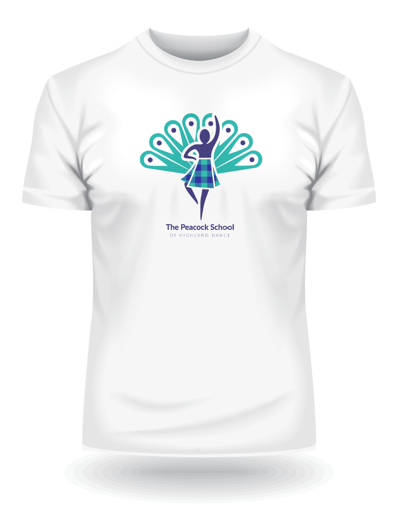
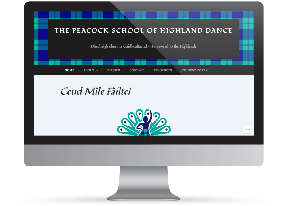
The client had a website and facebook that were in need of unifying elements to match the logo. He was also interested in getting logo that would work well on a t-shirt and a set of business cards.
I used the tartan colors from the logo to create assets that the client could incorporate himself into his various sources. I added detail to the tartan for these various web assets, this allows him to incorporate it into cover photos and as accents for various images on the site at a larger scale than his logo.
Creating a t-shirt version of the logo required the removal of drop shadow and sizing down the logo to fit the width of a t-shirt torso.
Creating the business cards was as simple as using the tartan once more for a compelling back and adding the peacock feathers cheekily. A simple typographic layout allowed for these other two elements to shine through.

Working on this brand identity was a very fun experience harkening back to my own time in Scotland. Working with a client who was both very fun to work with but also very challenging was a great experience as well. The results from the collaboration was something the client was very happy with and was excited to use in his just beginning business. It was a pleasure doing the work his non-profit pro bono.