Glissen
Audience and Name
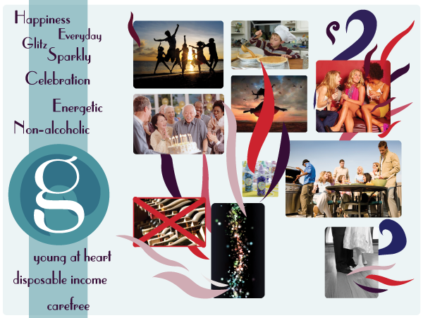
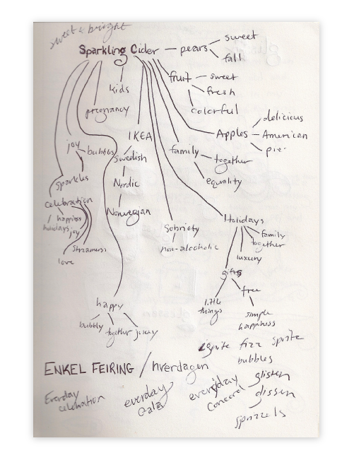
To create the identity of my sparkling cider, I delved into who I wanted it to serve and the emotions I wanted to capture. I wanted it to mean something to people, to tap into their happiest feelings put them in the mood to celebrate. Using a combination of word association and flowcharting to begin the process and the generating a mood board to finalize my ideas, I discovered a brand identity that was fun and footloose. I named the product Glissen.
Ideation
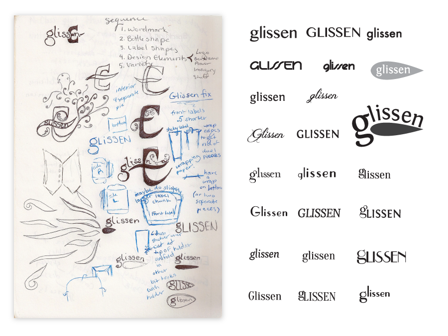
Using the brand identity I created I iterated on wordmark ideas, and delved into the typography of that word mark. I wanted to pick a font that toed the line between elegant and playful.
I landed on Parisish, a font that was refined with strong straight lines but had some soft curves. I wanted to use the double-story lowercase g instead of the single that came with Parisish so I used the foundations of the font to create a new g, one that fit the brand.

Packaging Ideation and iteration
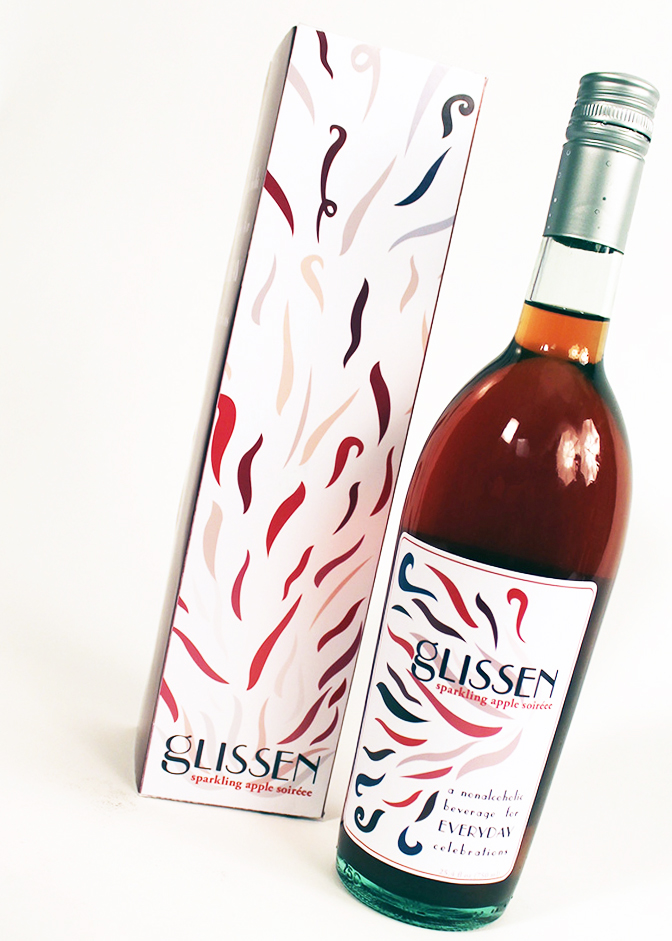
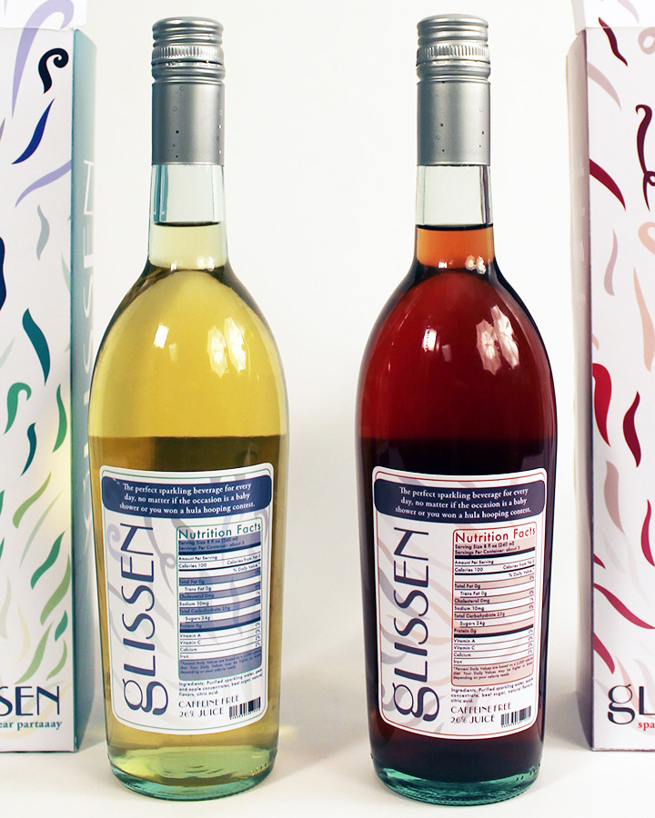
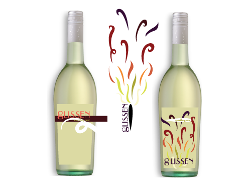
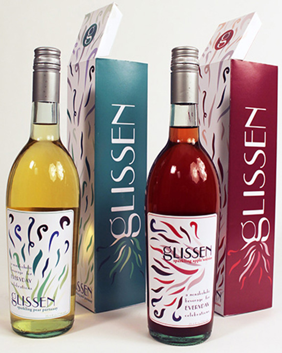
Using fireworks, wind, and plant seeds as inspiration I created a logo that fit into the brand identity of Glissen. Fireworks a physical representation of celebration. Wind is a whimsical thing, and plant seeds enjoy the ride, just like people enjoy a celebration, are buoyed by it. I originally used a color palette of fire but as I delved deeper I realized I wanted colors that matched the flavors. I ended up using a red based palette for the apple flavor and a teal based palette for the pear flavor.

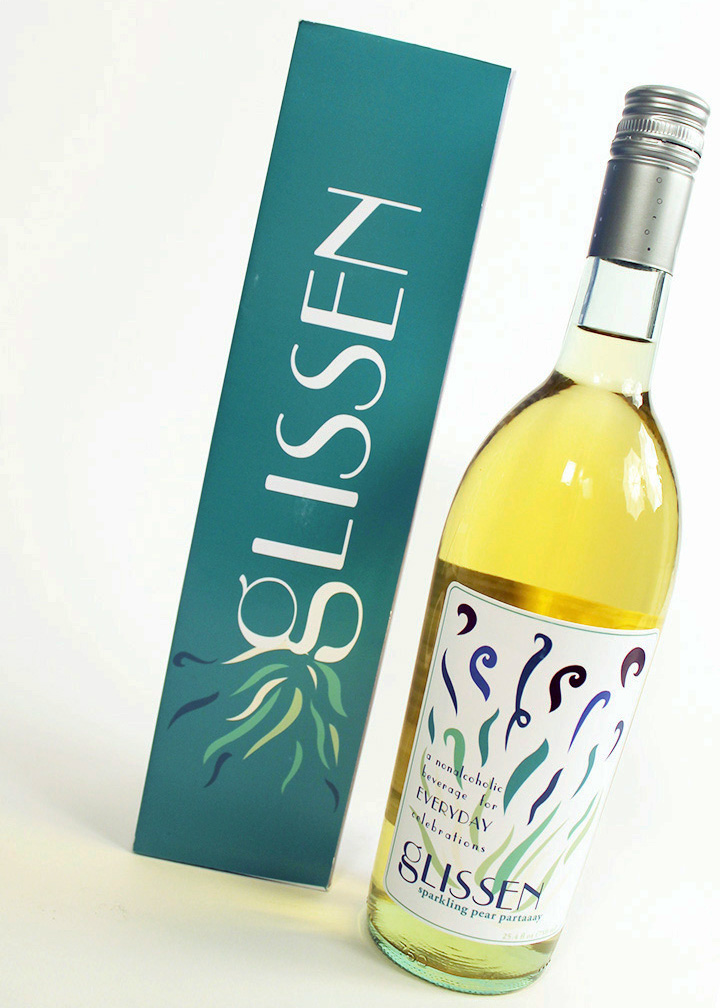
a non-alcoholic beverage for everyday celebrations
I wanted to design a beverage that captured the joyfulness of celebrating. No matter if the celebration is big, like a graduation, or a little smaller, like when you finally finished coding a website.
Glissen is marketed towards the uninterested in alcohol (be they young or be they old) so the packaging had to be both fun and sophisticated, in order to appeal to the wide age range.
Glissen comes in two delectable flavors: "Sparkling Apple Soiréee" and "Sparkling Pear Partaaay."